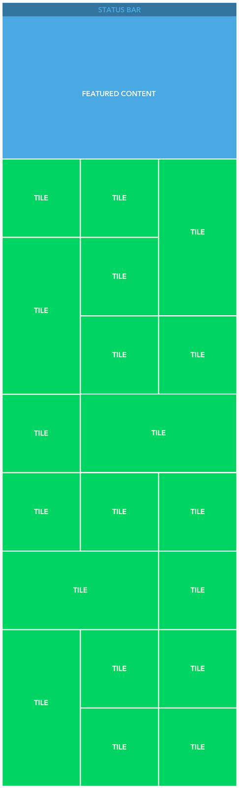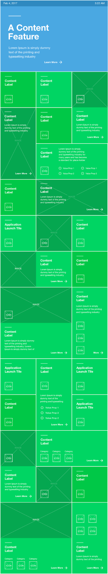


Discover
What Happens When You
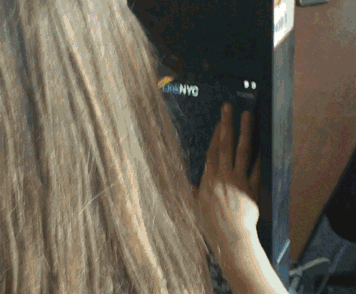
Tap Here?
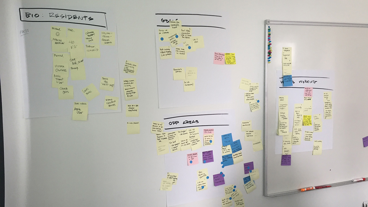
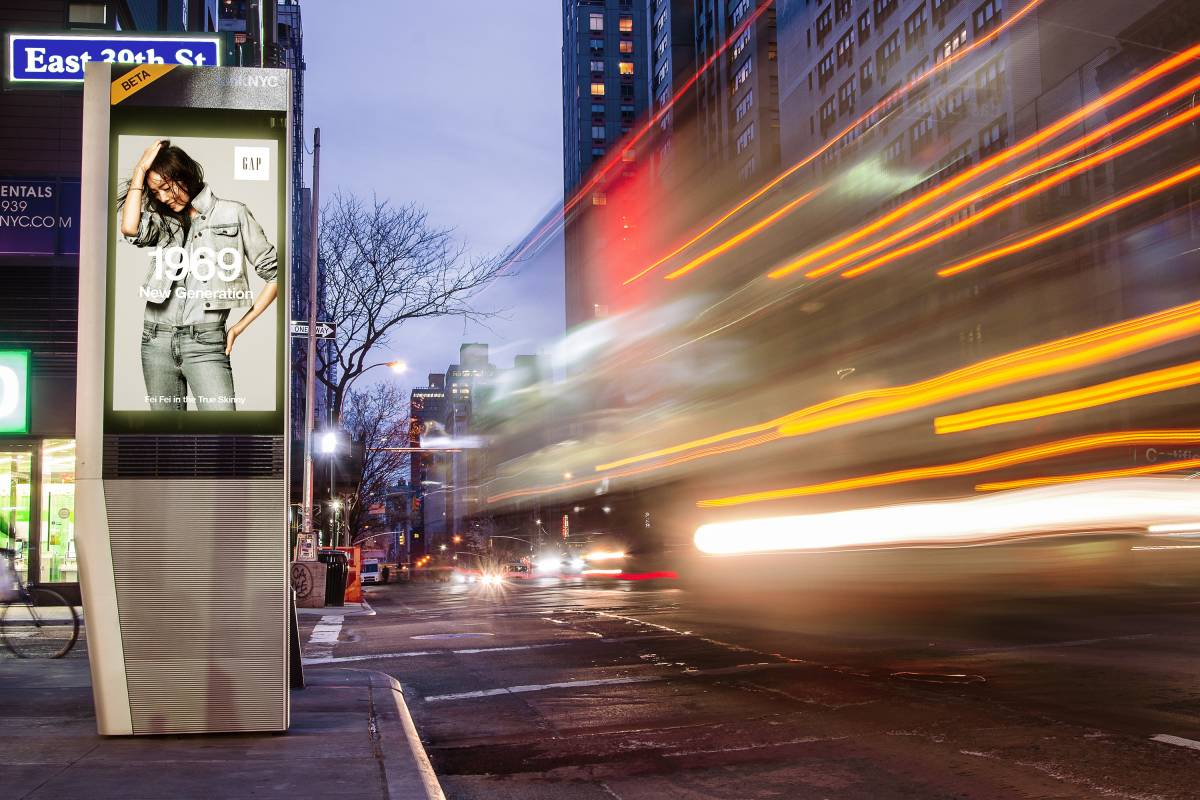
The Challenge
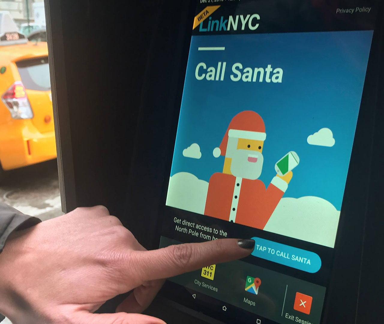
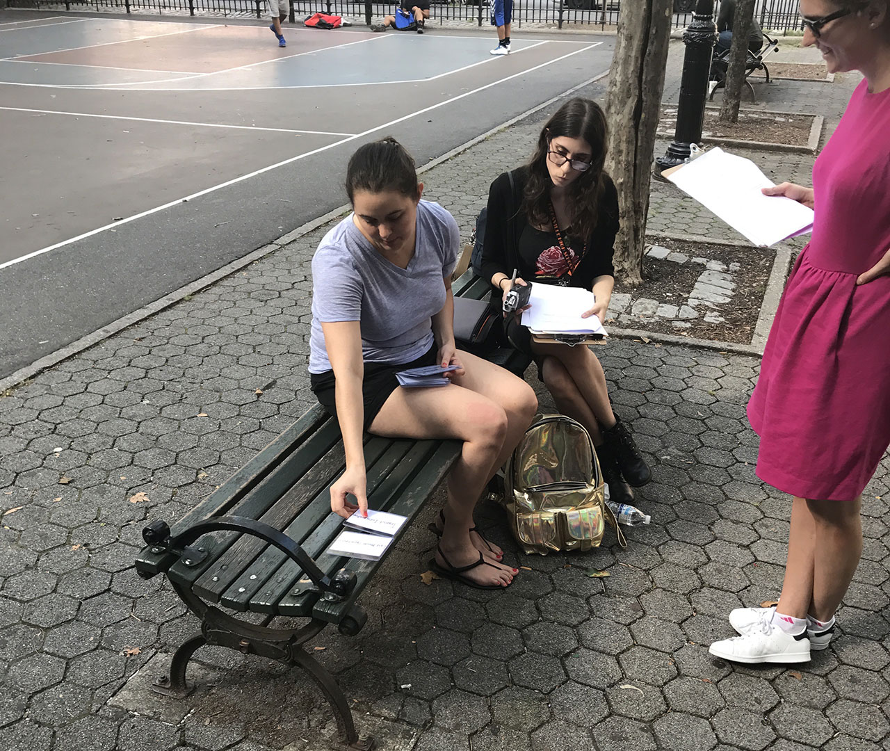
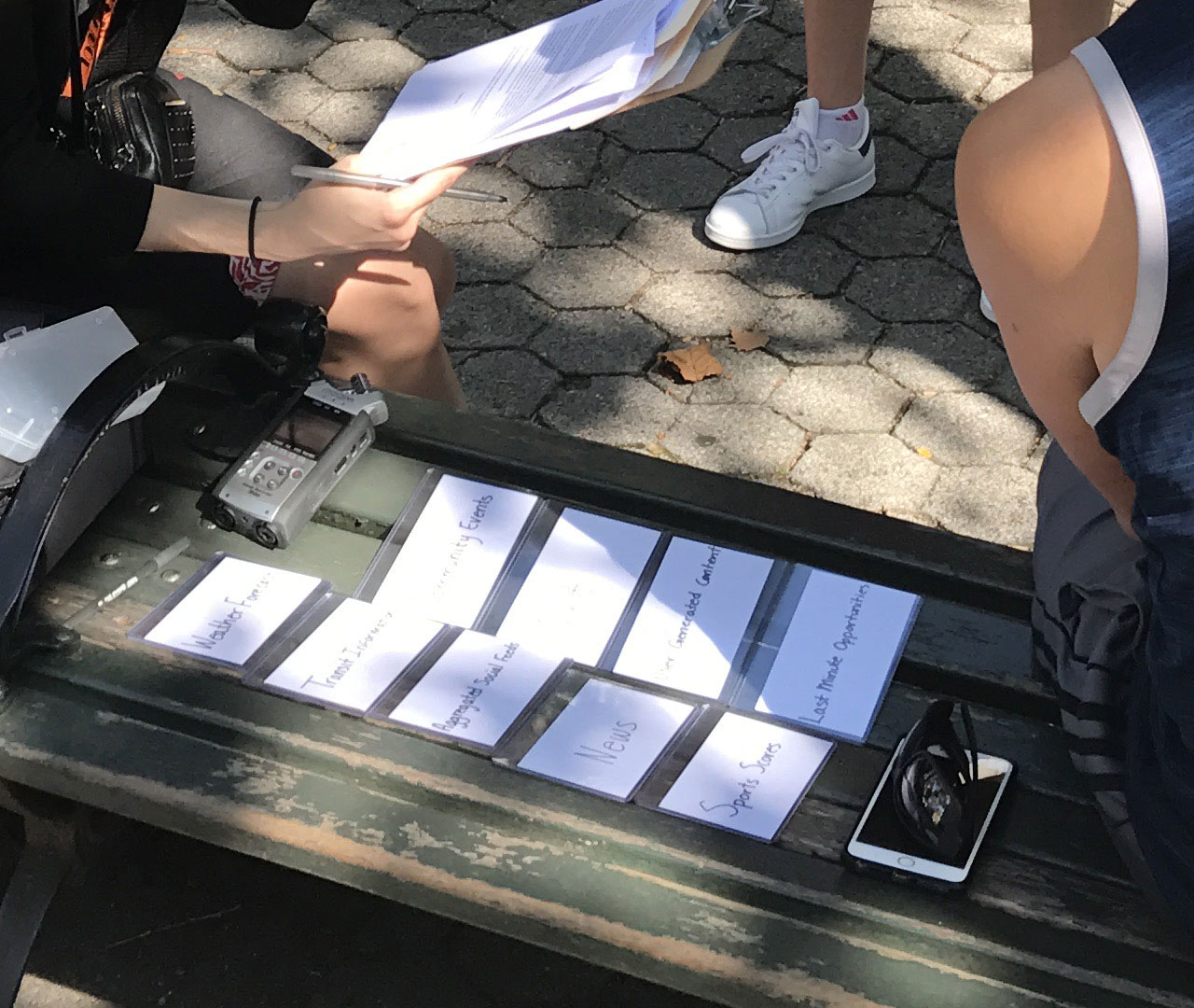
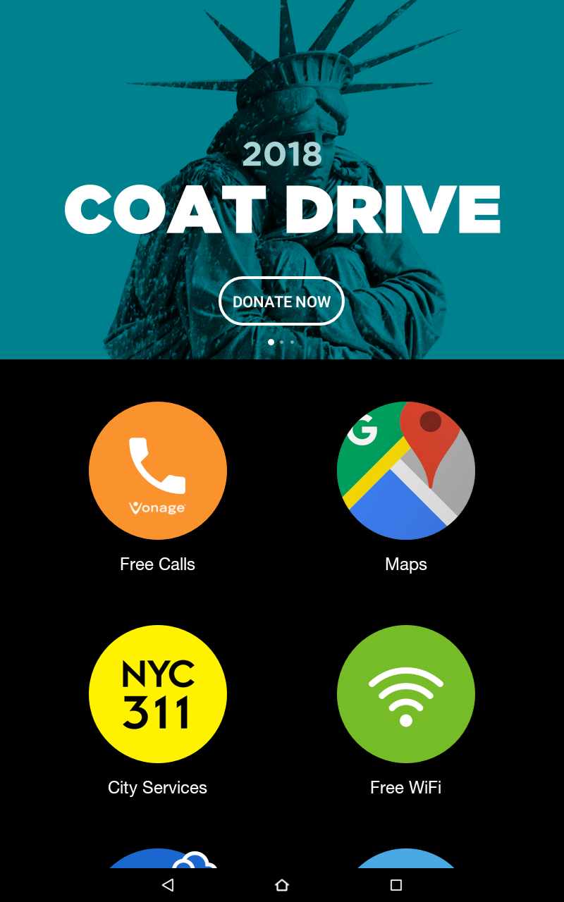
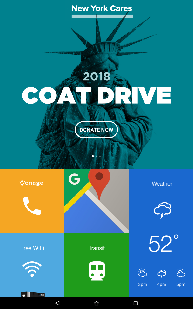
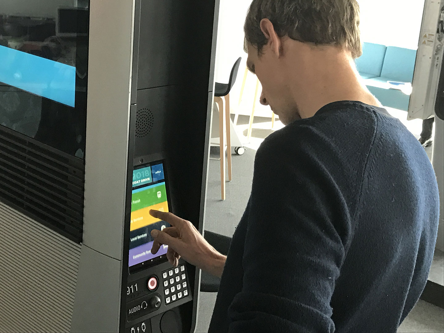
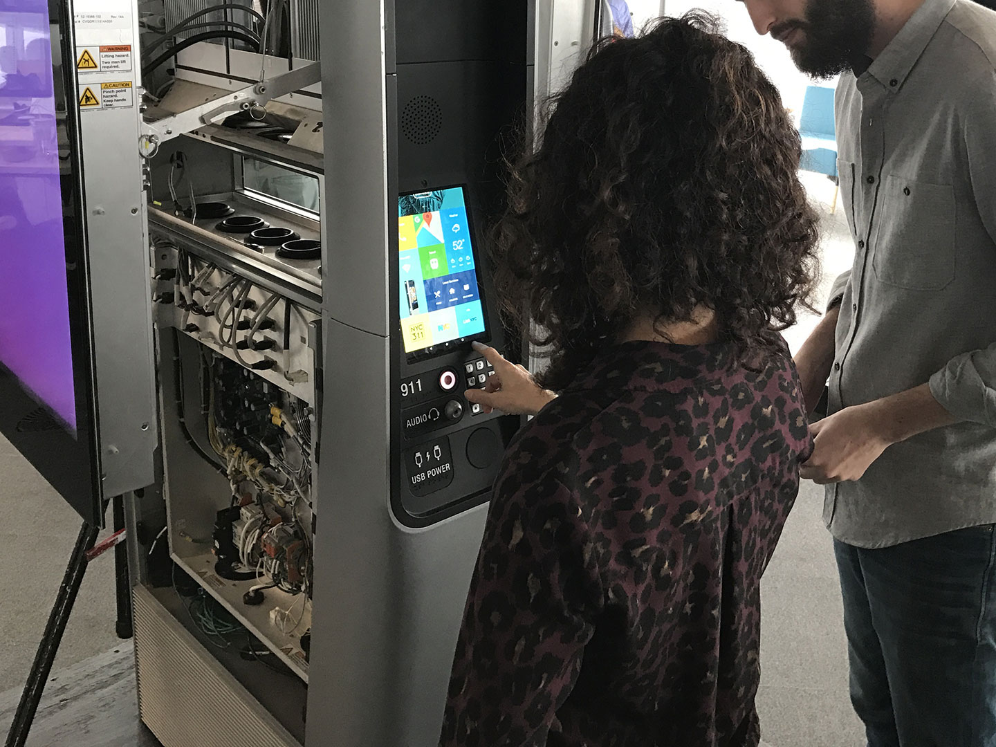
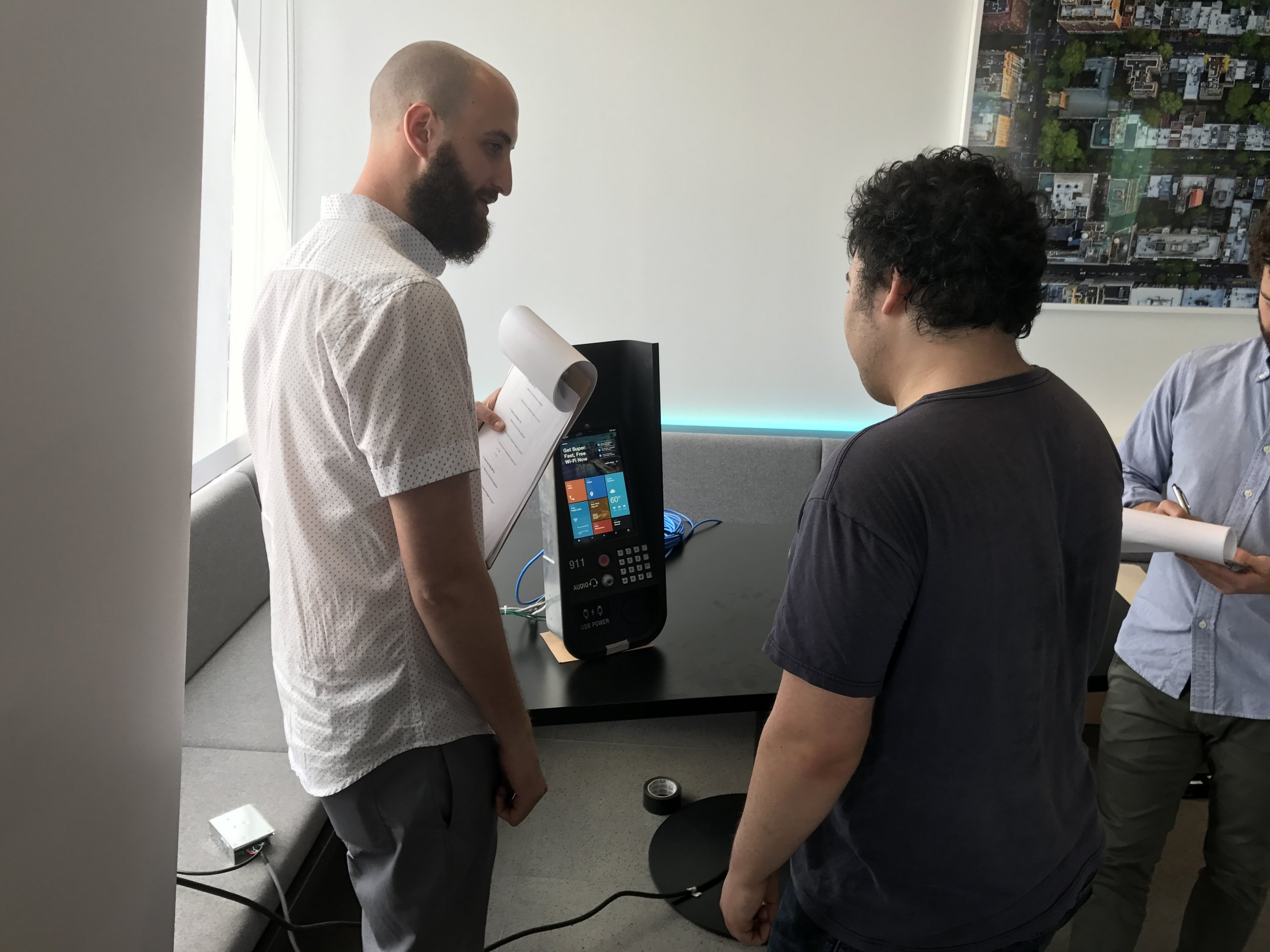
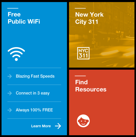
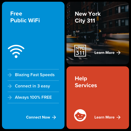
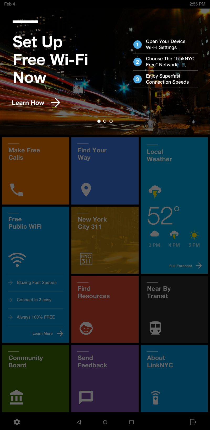
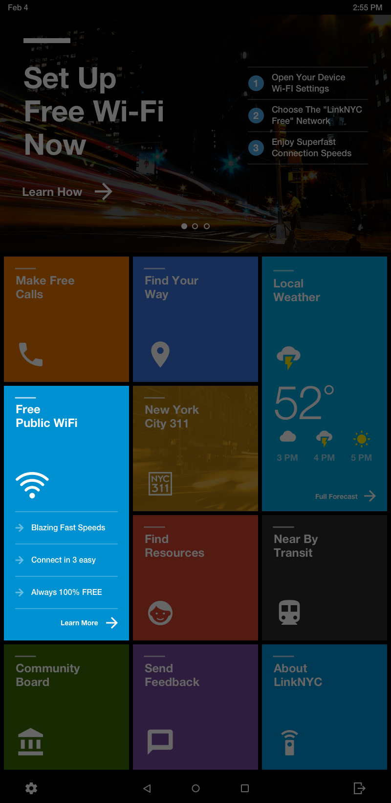
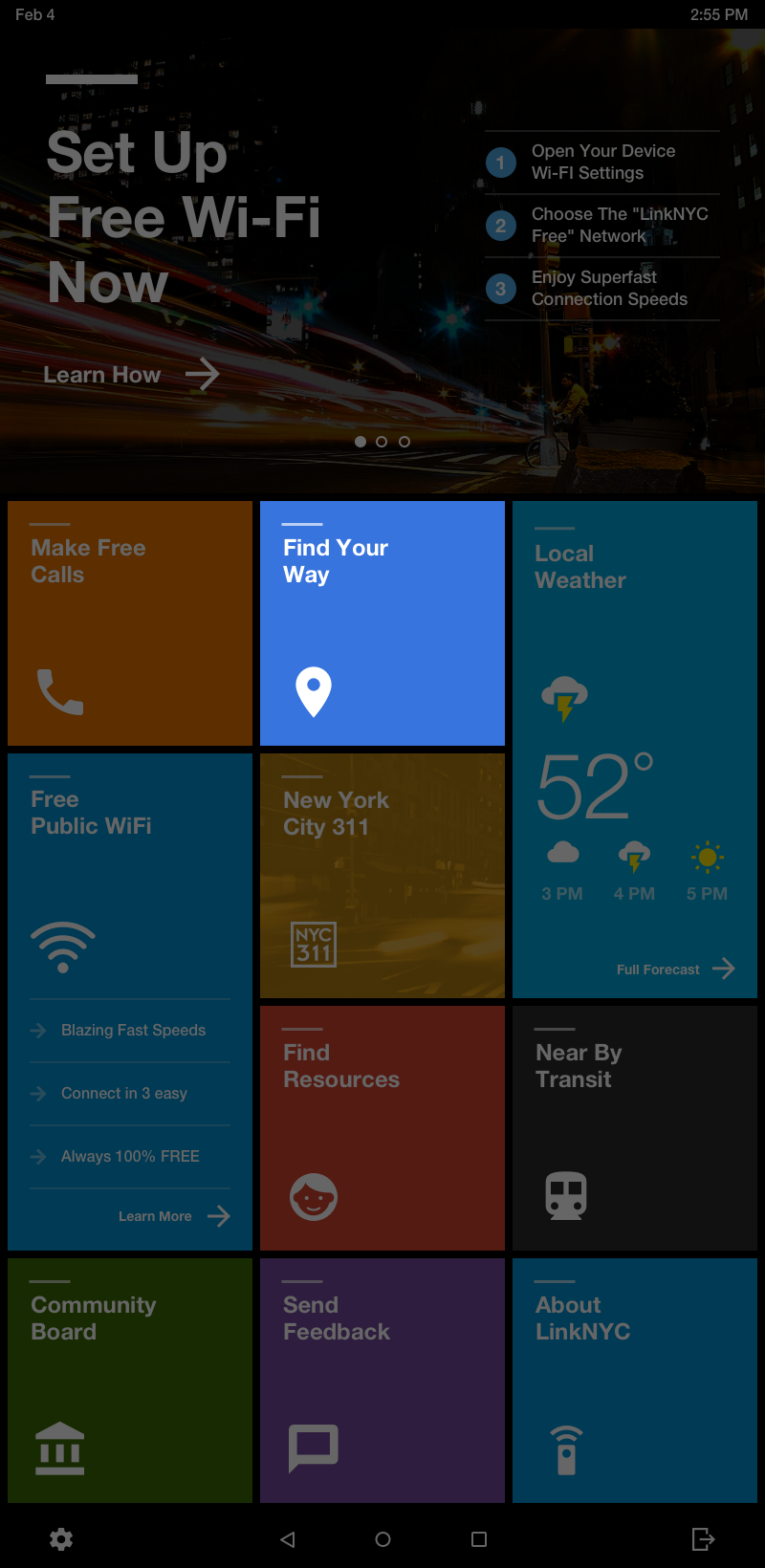
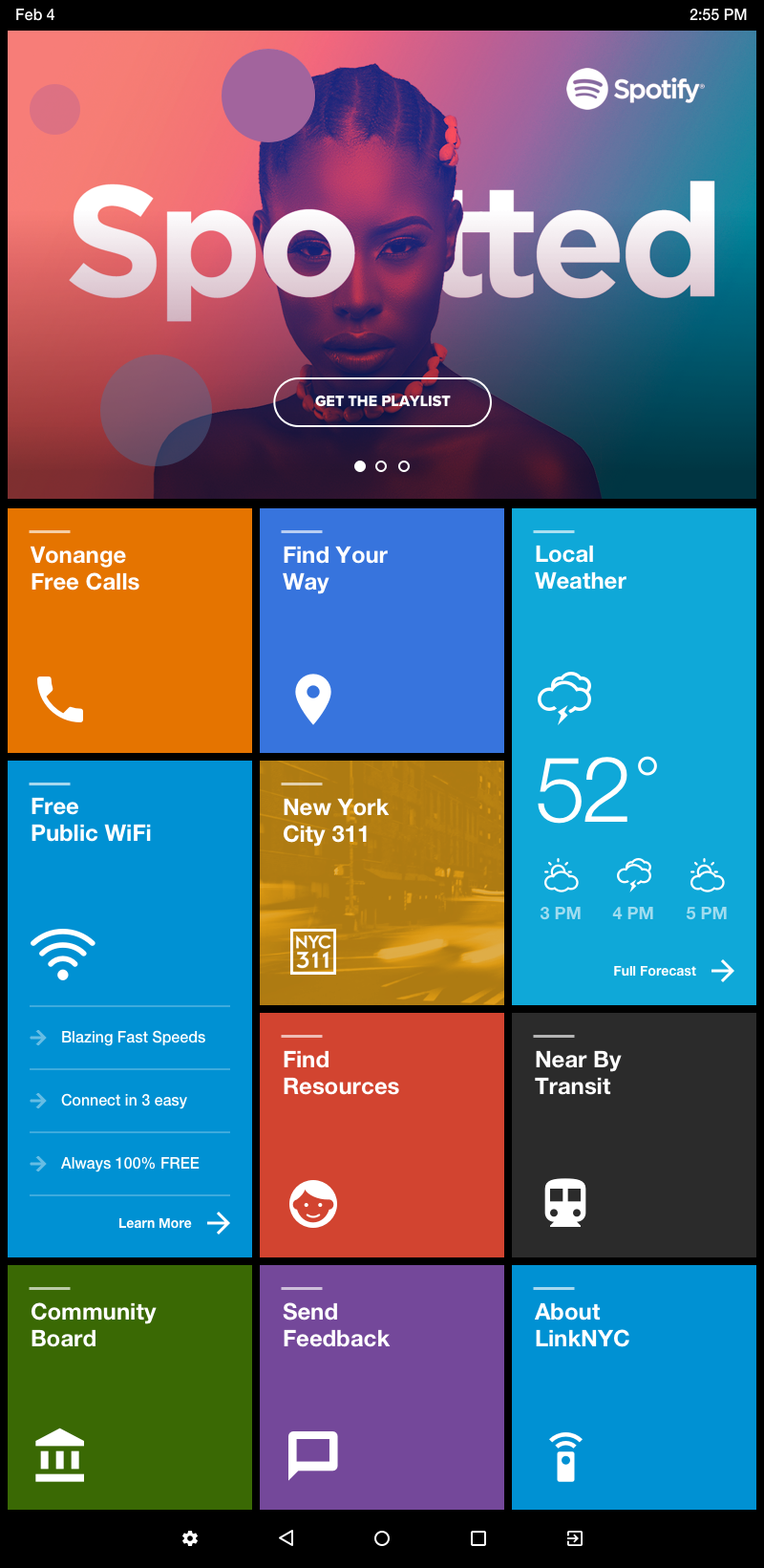
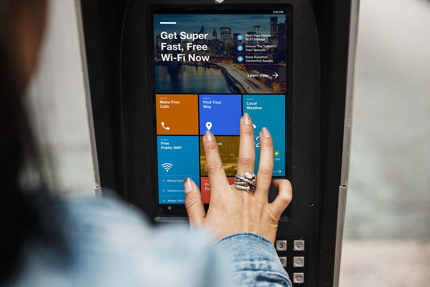
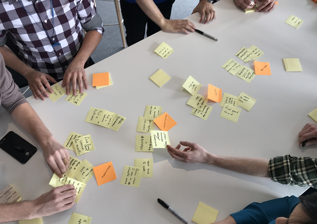
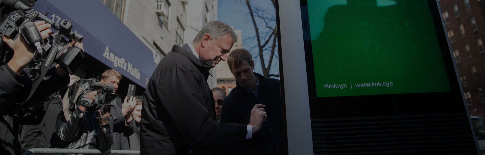
After the ambitious undertaking that was the launch of LinkNYC, Google-owned Intersection wanted to explore the full potential of kiosk’s tablet feature. Two years into the fist Link being installed, the tablet’s potential remained untapped and the promise to provide connectivity to all New Yorkers. While it served the purpose of complementing the content show on the monolith’s signature ad screens, the campaigns only served static content and the features offered by applications like Google Maps, Wi-Fi Calling, Weather, 411 and Others.What We Didn’t See Coming
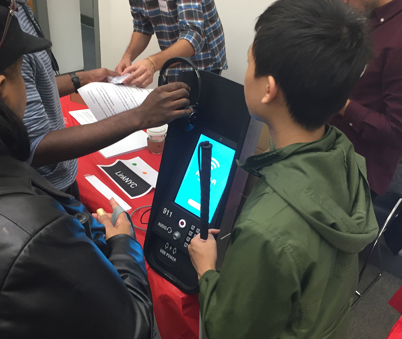
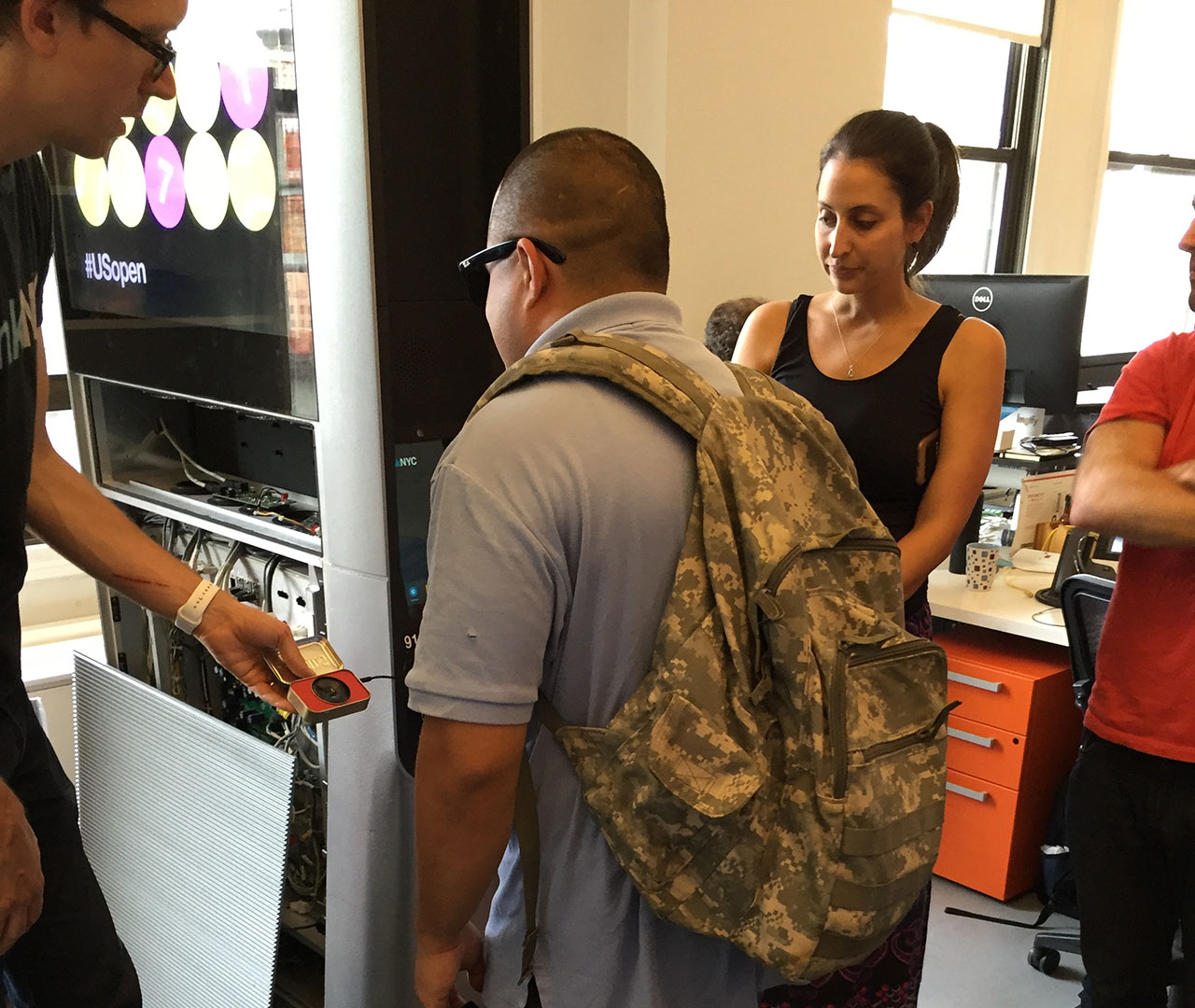
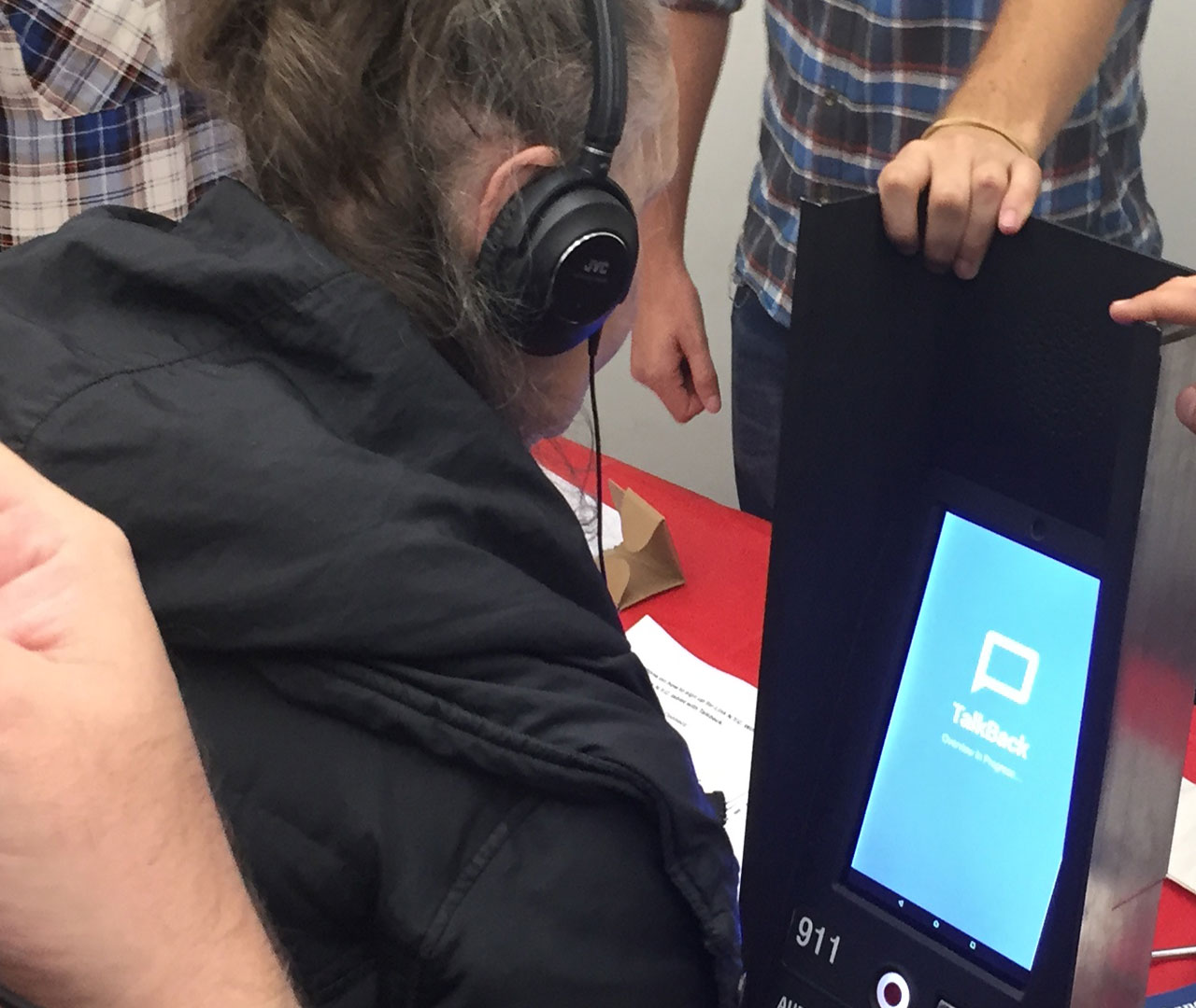
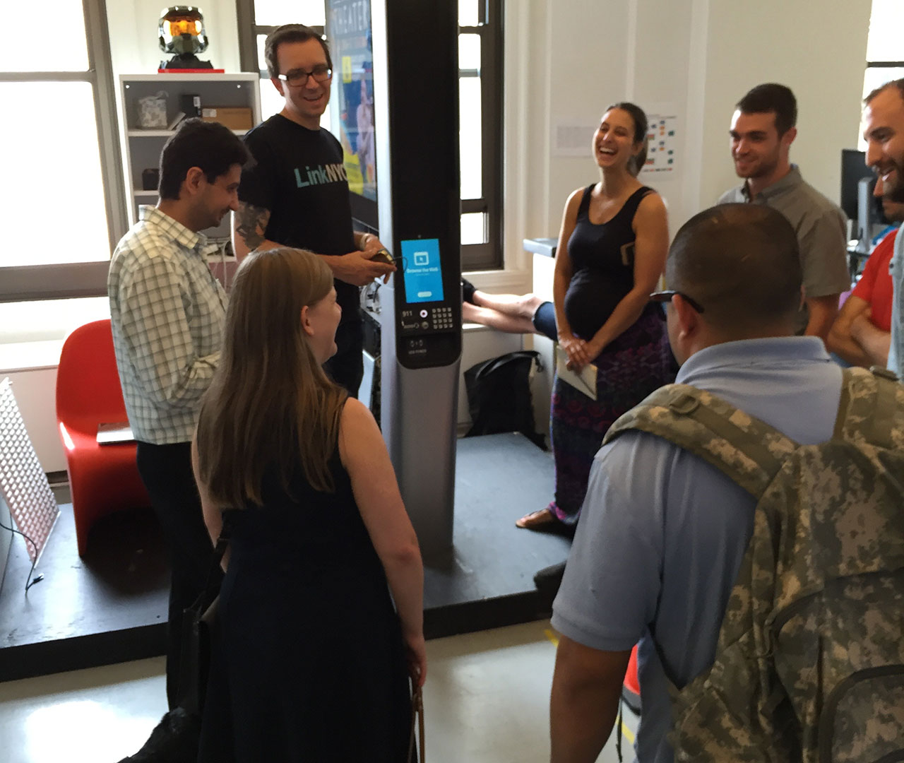
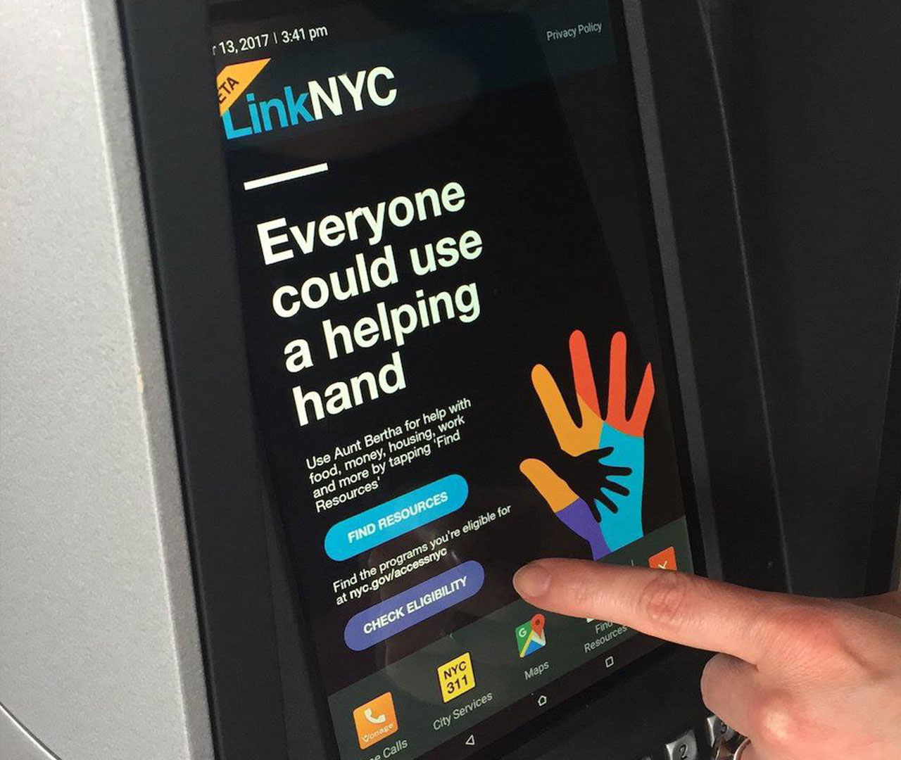
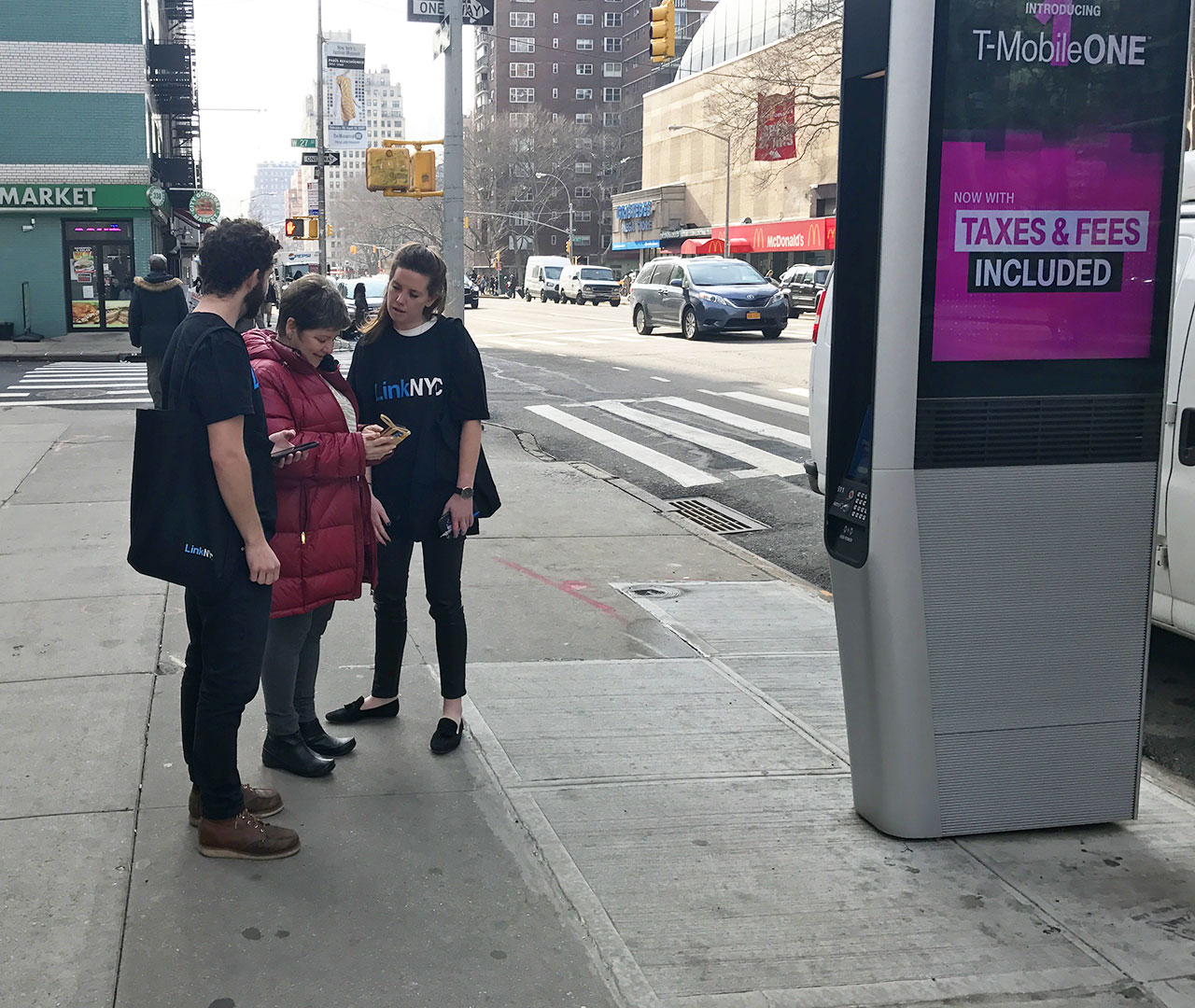
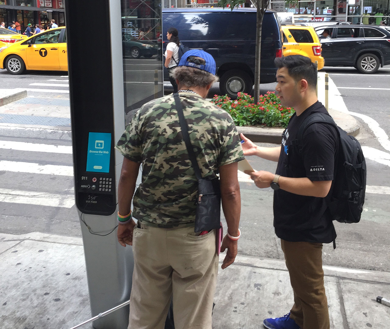
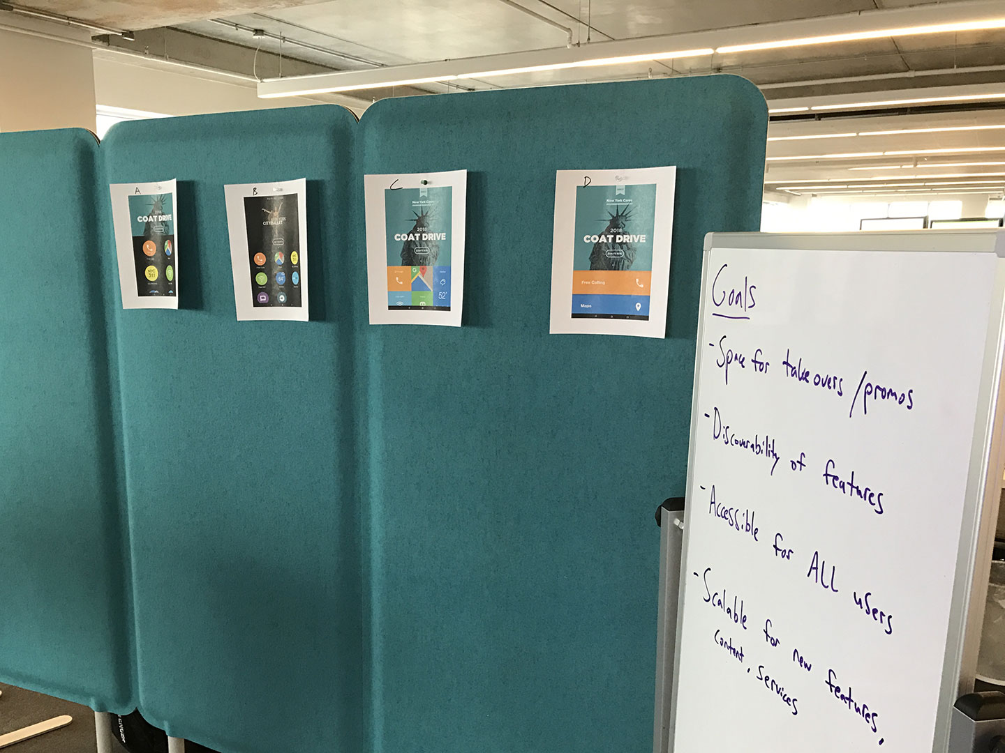
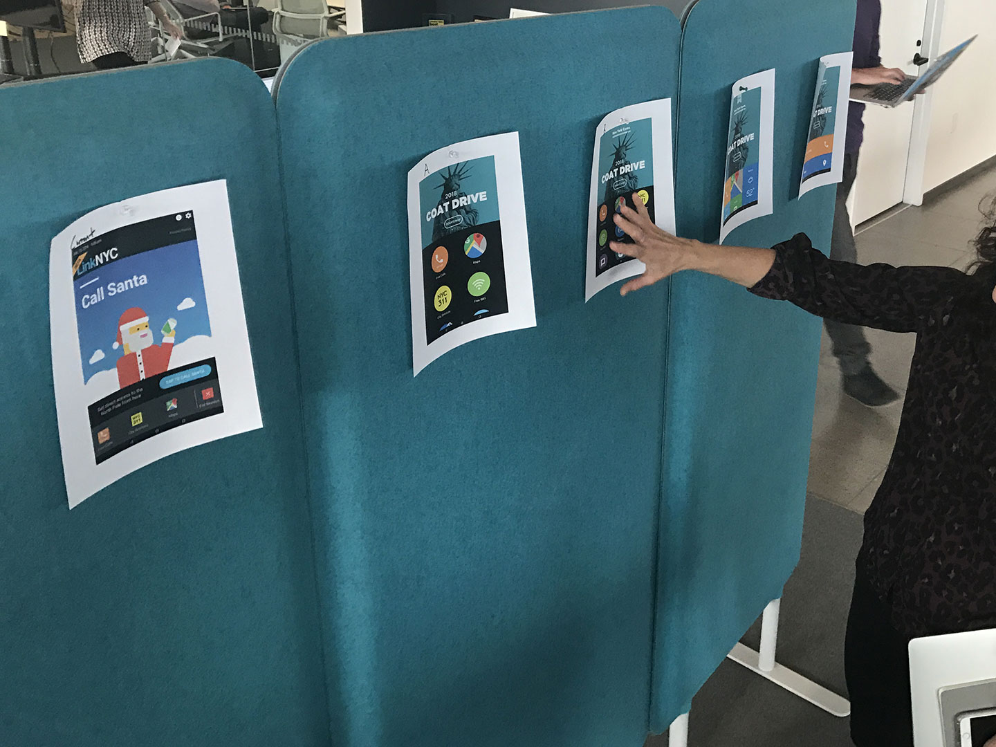
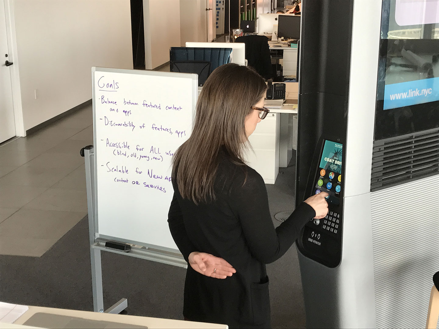
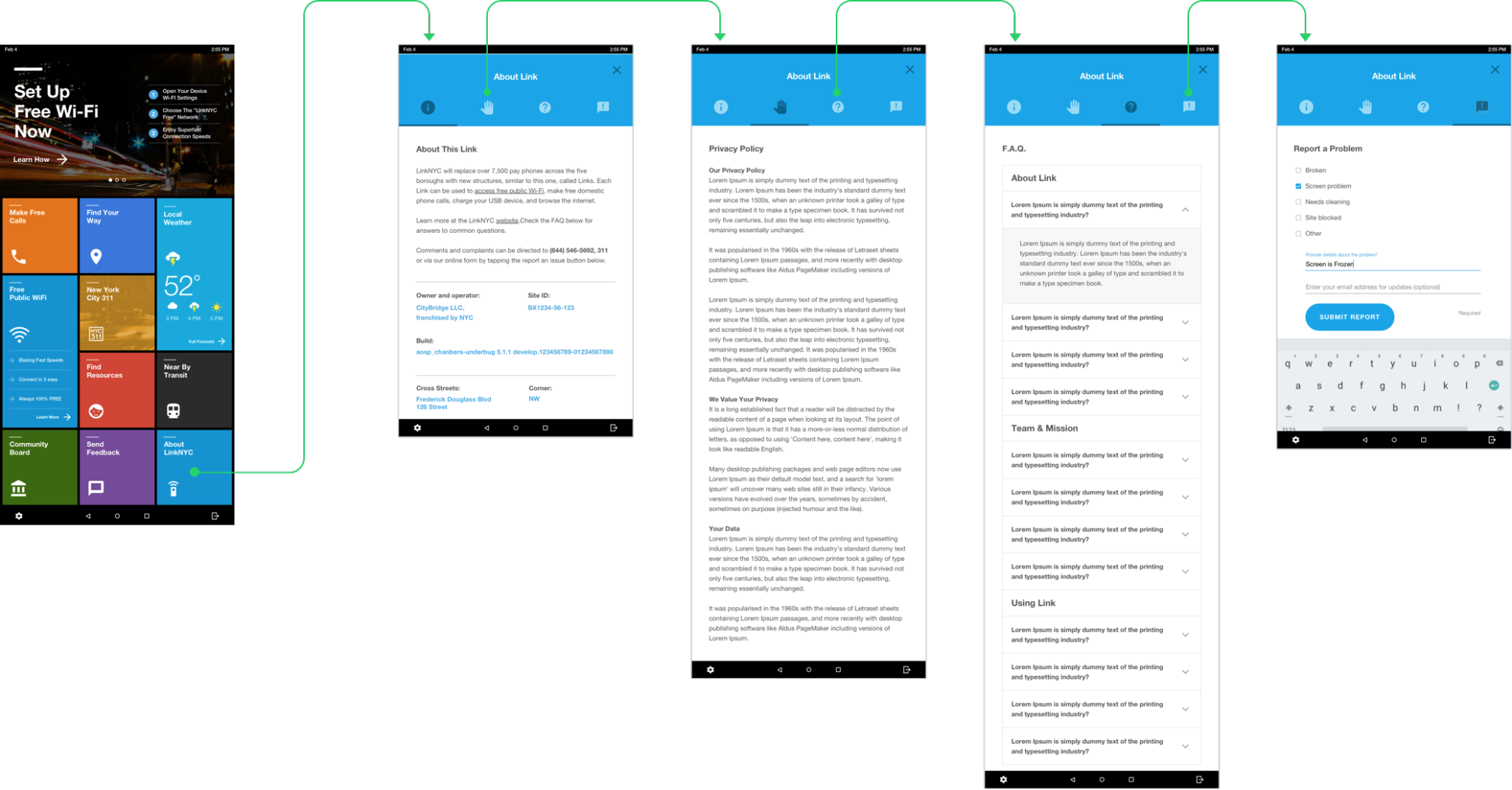
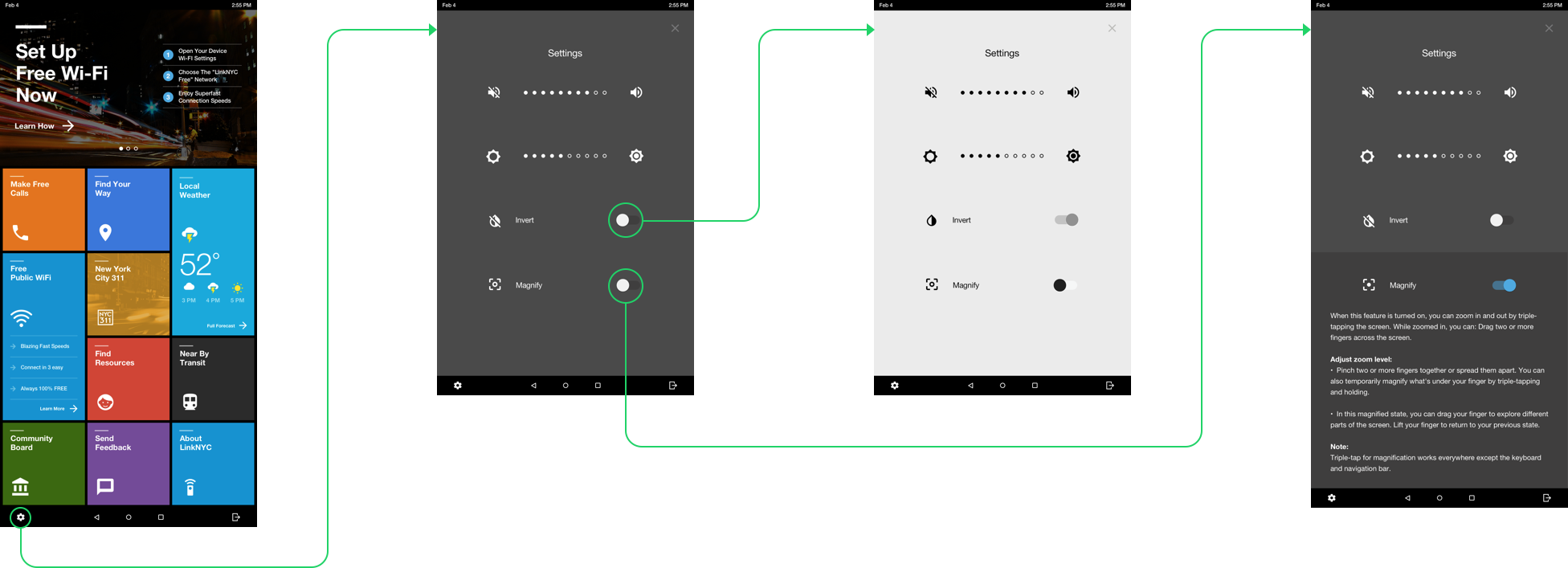
Around the same time our design team decided to take on redesigning the tablet operating system, our product team faced the challenge of quickly addressing accessibility issues that could jeopardize the entire program. In order to ensure we addressed those issues with properly, we enlisted the help of the Mayor’s Office for People with Disabilities.We took this opportunity to redesign the tablet experience from the ground up, by addressing some of the basic challenges low-vision and visually impaired users faced while interacting with the experience.